
A Head Full of Wishes is a site for Galaxie 500, Luna, Damon & Naomi, Dean & Britta and Dean Wareham. With news, articles and lists of releases and past and future shows.
Substack
The Luna record sleeve art gallery (part two)
Last time out I reached The Days of Our Nights in Luna’s art gallery before I realised things were getting a bit lengthy. Now, time to wrap things up, first with the remaining studio albums and then a few extras at the end.
Romantica (2002)

The painting of the lighter on the front of Luna’s sixth album is by Steve Ellis and is one of a series of lighter pictures he had made - another turned up on the cover of the promo single of Lovedust and you can see even more hanging in the art gallery the band play in for the Lovedust video. I love this pic of Britta and Lee that I’ve pinched from Steve’s instagram.

Here’s the video in full:
https://www.youtube.com/watch?v=qZ3S_5i3Mj0
In a previous post I expressed some concern with the painting - a problem that is entirely mine!
The problem I have is that the lighter, being a lighter, I guess, isn’t rectangular - on the CD sleeve it's wider at the top than the bottom. Now, in my head it is rectangular, which means that whenever I look at the sleeve my brain keeps telling me that the lighter is... wonky. It looks... wrong, like a mistake has been made when I know it hasn’t.
When Dean played at Indietracks in 2014 Raymond Richards, Dean’s guitarist during 2014, gave me a lighter with the Romantica design on it - this wasn’t merch but I guess a sort of bootleg item. Since I have absolutely no use for a lighter it is still full of fuel, and works, although I do worry that it’s going to spontaneously combust.

A drawing by Steve Ellis of a/the lighter also made it onto a very cool Luna T-shirt (which I can’t model for you since I never got around to getting one).
A, and I presume this, Steve Ellis will be making another appearance further down the page.
I do also love the reflection photo on the back of the album by Stefano Giovannini - I do love reflections, and I love that the photographer is putting in an appearance!

Design by Frank Olinsky, lighter painting by Steve Ellis, band photo by Stefano Giovannini.
Rendezvous (2004)
OK this is the bit that needs to be flagged as NSFW! The sleeve of Rendezvous is by photo artist Chas Ray Krider and until I wrote a post in the my record collection series on Rendezvous I hadn’t thought about looking into his work. The front shows a young woman to the right of the image, smoking in her underwear. Suffice to say that she is wearing considerably more than most of the young women in Mr Krider’s photos… and being considerably more… coy!

You can find more of his pictures around the internet but… be warned there’s a lot of nudity involved!
- I suspect the images used in Rendezvous were from his Motel Fetish series, although I haven’t found the actual pictures (although I’m sure I’ve seen them somewhere).
- There are a couple of Instagram accounts @chasray and @chasray_art_oddities.
- The official website/shop can be found at The Chas Ray Krider Collection.
I do rather like this sleeve but my oft-mentioned prudishness forces me to make this section shorter than the others!
Design by Frank Olinsky, photographs by Chas Ray Krider.
… and now on to the extras.
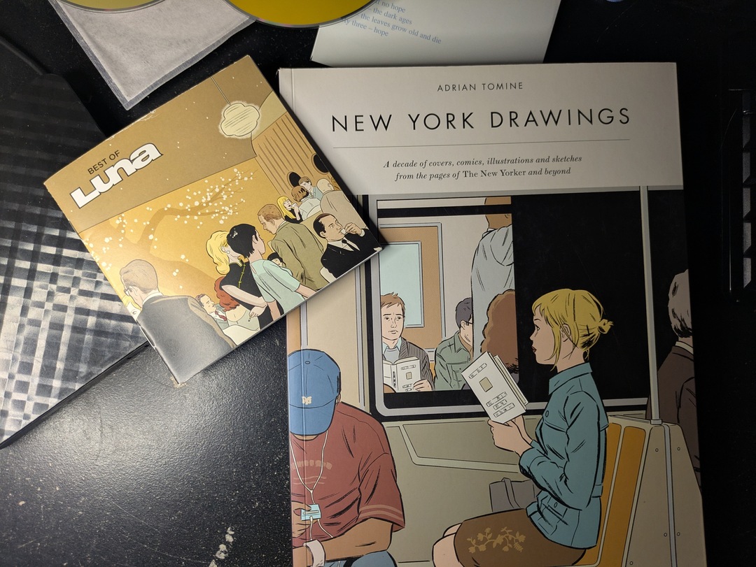
Best of Luna (2006)

Best of Luna has a beautiful illustration by Adrian Tomine, the rare case of an artist I loved the work of before his art turned up on a Luna album, although I most likely heard about him via The Galaxie 500 Mailing List, or via someone else mentioned on the list.
On release of Best of Luna there was a limited edition signed print available that I shied away from since it was a bit pricey for my natural meanness. I have however subsequently got a print of a different drawing signed by Adrian on my wall (thanks to Andrew). It also has the same name as a Luna song so it almost works!

The picture on the sleeve was included in the collection New York Drawings.

I suspect Adrian Tomine is probably most famous now for his drawings for The New Yorker, and possibly most famously for “Missed Connection” which was also on the cover of New York Drawings.
Dean mentions that the lyrics of the Luna song Dear Diary concern “spying a cute girl on the train, and she’s reading silly magazines and singing a song, and I can’t stop thinking about her” which has a bit of a missed connection feel.
An LP version of Best of Luna would be good so I can get a 12” square version of Tomine’s drawing!
Art Direction by Frank Olinsky, cover art Adrian Tomine. Photos Michael Lavine, Nitin Vadukul, Stefano Giovannini, John Arsenault.
Lunafied (2018)
The cover of Lunafied is by artist and photographer Abelardo Morell and is one of a series of astoundingly beautiful photos taken by turning various rooms into a camera obscura.

When Lunafied came out digitally in 2006 I wrote to Dean about the sleeve:
4th July 2006 00:43
From: Andy Aldridge <andy@grange85.co.uk>

Hi Dean,

I love the "sleeve" of the Lunafied album - particularly as I've been sucked into the pinhole-camera thing of late* so camera-obscura's are very exciting - I keep wanting to turn our bedroom into a camera obscura but Hazel rightly points out that the row of Victorian terraced houses on the opposite side of the road isn't quite the Empire State Building!

Does Lunafied exist as a "real" CD (maybe as a promo???) I'd love to own a proper CD with that sleeve! (sorry for the unsubtle attempted scrounge there!).

Any news on the Beggars covers album?

Have a nice summer,

-=Andy=-
4th July 2006 14:52
From: Dean Wareham

Hi Andy,

the lunafied image is by Abelardo Morell, but perhaps you knew that already. His photos are great.

http://www.abelardomorell.net/

But there is no CD with that image, not even a promo. Rhino wanted it to be exclusive to the iTunes store. They have said that they might get around to releasing it on CD one day, but frankly I don't think it's going to happen. I can burn you a disc of Lunafied (from the master that was prepared).

Dean
Thirteen years on we finally got a Lunafied double album with Abelardo Morell’s beautiful Camera Obscura; The Empire State Building in Bedroom, 1994 that was used on the front, and the also beautiful Camera Obscura: Late Afternoon View of the East Side of Midtown Manhattan, 2014 and Camera Obscura: Early Morning View of the East Side of Midtown Manhattan, 2014.
On his website Abelardo explains how he makes these astonishing pictures (and cleared up how the inside and rear pictures are the right way up).
I made my first picture using camera obscura techniques in my darkened living room in 1991. In setting up a room to make this kind of photograph, I cover all windows with black plastic in order to achieve total darkness. Then, I cut a small hole in the material I use to cover the windows. This opening allows an inverted image of the view outside to flood onto the back walls of the room. Typically then I focused my large-format camera on the incoming image on the wall then make a camera exposure on film. In the beginning, exposures took from five to ten hours.
Over time, this project has taken me from my living room to all sorts of interiors around the world. One of the satisfactions I get from making this imagery comes from my seeing the weird and yet natural marriage of the inside and outside.
Several years ago, in order to push the visual potential of this process, I began to use color film and positioned a lens over the hole in the window plastic in order to add to the overall sharpness and brightness of the incoming image. Now, I often use a prism to make the projection come in right side up. I have also been able to shorten my exposures considerably thanks to digital technology, which in turn makes it possible to capture more momentary light. I love the increased sense of reality that the outdoor has in these new works. The marriage of the outside and the inside is now made up of more equal partners.
Abelardo Morell - Camera Obscura

I was happy to spend a long time browsing Mr Morell’s website, his other photos are also lovely!
Design and creative layout by Frank Olinsky, front cover, back cover and inside photos by Abelardo Morell.
A Sentimental Education (2017)

For Luna’s covers album the front cover is an abstract image by Finnish photographer Niko Luomo from his Adaptations series and is called Self-Titled Adaptation of Fourteen Sunflowers (1888), and abstract take on one of Van Gogh’s paintings of sunflowers.
I must admit that I like this cover more knowing how Niko makes the images - I had initially thought that it was a digitial art but…
I work at the studio. My photographic process is analogue. I use camera, light and film as my materials. As simply as possible, instead of one exposure, I use many overlapping exposures on one frame and one film.
Package design by John Conley, cover image by Niko Luomo.
EP (1998)

Justin Harwood recently posted a flyer on his Instgram for a show at The Supper Club in NYC that he described as being “one of about 50 with different graffiti” - and some of those were collected on the front cover of this EP which was released to coincide with Luna’s Australian tour in September/October of 1998.

The “graffiti” artists listed on the sleeve are Sean Eden, Steve Ellis (I guess the same one responsible for Romantica above), Lisa Burnett & Kirsten Collins (although on Justin’s Instagram post the Devo artwork was credited to Mollie Brown.)
The defaced photo was taken by Jill Greenberg.
A few I’ve left off
- Luna Live (sorry, it’s awful).
- Outdoor Miner (also awful… awful three times over).
- Dear Paulina (modesty forbids…).
… actually there are a load more - maybe I’ll visit the Luna’s singles art gallery in the future.
A couple of years ago I ranked Luna’s album sleeves - here’s how, although I might shuffle a few around in the wake of these two posts.
- Penthouse - photo by Ted Croner / I adore Ted Croner’s grainy night shots of NYC.
- Lunafied - photo Alberdo Morell / A gorgeous camera obscura photo - I emailed Dean to find out if it was going to have a physical release because the sleeve was so beautiful… it took 12 years but did… eventually.
- Best of Luna - illustration by Adrian Tomine / I was a fan of Tomine from way before this so having his art turn up on a Luna disc was a treat.
- Rendezvous - photo by Chas Ray Krider.
- Bewitched - / The reissue cover is lovely - it’s baffling that someone thought that the original sleeve was better.
- Lunapark - Raymond Loewy’s pencil sharpener / yes, pencil sharpener!?
- Pup Tent - photo David Levinthal.
- Romantica - painting by Steve Ellis.
- The Days of Our Nights - painting by Richard Phillips / I used to really dislike this but again, bigger art work made it better and I don’t mind it so much now.
- A Sentimental Education - image by Niko Luoma.
- Luna Live / This is awful, looks like a five minute Photoshop job - sorry if it was you.